Proposals/Navigation: Difference between revisions
From Mahara Wiki
< Proposals
No edit summary |
|||
| Line 2: | Line 2: | ||
[https://mahara.org/interaction/forum/topic.php?id=8294&post=33161 Accompanying discussion] | [https://mahara.org/interaction/forum/topic.php?id=8294&post=33161 Accompanying discussion] | ||
[https://bugs.launchpad.net/mahara/+bug/1782954 Wishlist item on Launchpad] | |||
= Main menu = | = Main menu = | ||
Revision as of 03:40, 24 July 2018
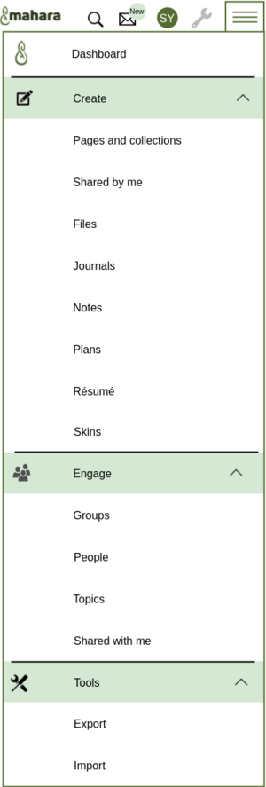
Proposal for adjusting where menu items are situated in the main and user menus to make navigating the site easier.
No functionality change
- No distinction between "Content" and "Portfolio". Everything relating to these two items is placed in the "Create" sub menu except "Export" and "Import", which move to the "Tools" section.
- The words from the homepage "Create" and "Engage" are re-used to make the connection to these actions.
- The menu sections receive an icon each, but not the individual items as that would get too busy.
- The section headings (Create, Engage, Tools) do not go to the first item in that section as they would currently do, but are clickable to expand the section. The chevron stays in place as visual indicator that the section can be expanded / collapsed.
New mock-up taking into account feedback received:
Functionality change
We also looked into the possibility of combining a couple of screens that have similar functionality to allow certain actions to be performed more quickly.
Same as above plus:
- Combine the "My groups" and "Find groups" pages into "Groups" and provide all functionality on one screen.
- Consolidate "My friends" and "People" pages into "People" and use filters to a) show only friends, b) search only friends, others in the institution, everybody
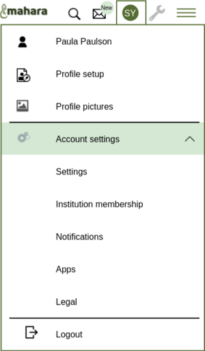
The user menu would stay mostly the same as right now. The changes are:
- A link to the profile setup (Currently under "Content" -> "Profile") and the profile pictures would be added to make these more easily accessible and indicate that they are a user profile rather than portfolio content.
- The "Inbox" is moved out of the user menu again to make it more visible.
- The "Logout" link would be separated visually a bit more than it is right now.


