Proposals/Done/Page layout revision: Difference between revisions
From Mahara Wiki
< Proposals | Done
m (Anitsirk moved page Developer Area/Specifications in Development/Page layout revision to Proposals/Page layout revision: Shorter navigation, not always technical) |
m (Anitsirk moved page Proposals/Page layout revision to Proposals/Done/Page layout revision without leaving a redirect) |
Revision as of 17:50, 11 July 2020
Introduction
Leading question: How can we make Mahara pages looks less administrative and "blocky" and more like a web page when there is no assessment required?
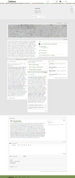
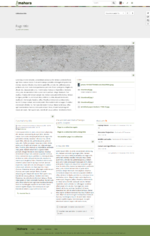
Mahara pages are built with the help of blocks. They have a header area in which also the collection navigation sits. There is no possibility to have a banner image unless it sits below the page header in a block going across the width of all blocks.
Furthermore, showcasing portfolio content and assessing portfolio content is all done from Mahara pages. I.e. there is no special assessment mode dedicated for giving feedback or grading, but all portfolio content is displayed in the same manner, on a Mahara page. That does have the advantage that building portfolios for multiple purposes is the same no matter what sort of portfolio is chosen. However, it does have the disadvantage that Mahara pages look blocky because the content flow is interrupted by elements required for assessment purposes, i.e. the "Add comment", "View comments", and "Details" links in particular.
Wishlist item for phase 1: Page header area changes
Main ideas
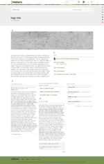
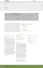
- Re-design the header space used for page headings and collection navigation to allow for a separate colored background and image upload.
- Remove the big buttons right below the page heading and move them elsewhere on the screen making them less prominent in design.
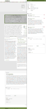
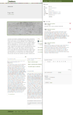
- Make the commenting possibilities in thus assessment features and drilling deeper into content a secondary click by using a sort of "overlay" to access them. That can also mean that if an assessor is viewing pages, they can pull in the overlay once and it sticks for other pages as well so that they don't have to click a button all the time.
Options
Notes:
- For the time being, the overlay option is called "Assess".
- Each option is accompanied by 3 wireframes:
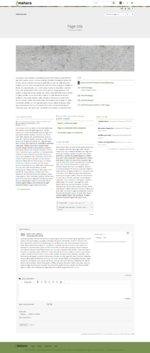
- Default view
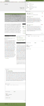
- Assessment view
- Details view
Option 1
Characteristics:
- Buttons outsourced to the top of the header area; just icons (will display text on hover and have descriptors for screenreaders); only main buttons, secondary options accessible via "More options" menu button
- Collection title: left
- Collection navigation drop-down menu: right
- Page title: centered
- When "Assess" is clicked, all blocks that have assessment options, i.e. commenting, extra details, receive a colored bar on top of their block that contains the options to be clicked.
- When the assessment bar is clicked, the bar changes color and a modal pops out that contains the details and comments and further actions can be performed on that particular artefact, e.g. comments left, files downloaded.
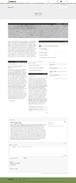
Option 2
Characteristics:
- Buttons outsourced to the right of the header area; with text; only main buttons, secondary options accessible via "More options" menu button
- Collection title: centered
- Collection navigation drop-down menu: below page title
- Page title: centered
- When "Assess" is clicked, the page background changes and for all blocks that have assessment options, i.e. commenting, extra details, the options are displayed.
- When they are clicked, the block is outlined in the primary theme color and a modal pops out that contains the details and comments and further actions can be performed on that particular artefact, e.g. comments left, files downloaded.
Option 3
Characteristics:
- Buttons outsourced to the right of the header area; without text (will display text on hover and have descriptors for screenreaders); all option buttons are shown
- Collection title: left with colored bar behind it
- Collection navigation drop-down menu: right of the collection title
- Page title: left
- When "Assess" is clicked, the "Assess" icon is displayed on the left on all blocks that have assessment options, i.e. commenting, extra details, the options are displayed.
- When the icon is clicked, it is highlighted in the primary theme color and a modal pops out that contains the details and comments and further actions can be performed on that particular artefact, e.g. comments left, files downloaded.
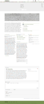
Option 4
Characteristics:
- Buttons outsourced to the right of the header area; just icons (will display text on hover and have descriptors for screenreaders); only main buttons, secondary options accessible via "More options" menu button
- Collection title: left with underline
- Collection navigation drop-down menu: right of the collection title
- Page title: left
- When "Assess" is clicked, the "Assess" icon is displayed on the right on all blocks that have assessment options, i.e. commenting, extra details, the options are displayed.
- When the icon is clicked, the block is highlighted in the primary theme color and a modal pops out that contains the details and comments and further actions can be performed on that particular artefact, e.g. comments left, files downloaded.
