Proposals/SmartEvidence/SmartEvidence with rubrics, artefact and page alignment
From Mahara Wiki
< Proposals | SmartEvidence
SmartEvidence is a powerful tool in Mahara to visualize skills and competencies and how much experience a person has.
In SmartEvidence and rubrics we looked at how rubrics could be integrated into SmartEvidence.
At Hui19 in Kassel on 30 November 2019 we took that idea further and also looked at whether it were possible to bring everything into one map. Additional ideas from other discussions with community members also contribute to the overall design of this functionality.
It should be possible to:
- Align individual pages to one or more standards;
- Align individual pieces of evidence to one or more standards when they can stand alone and don't require a page;
- Use rubrics / different levels within a single framework.
The following is a start of the specifications that contribute to that feature.
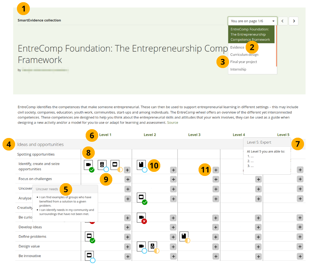
The map shows:
- Header of the SmartEvidence collection. It includes
- navigation through the collection
- the title of the page you are currently viewing
- portfolio owner
- any tags if tags are used on the current page
- on the SmartEvidence overview page it also shows the brief description of the framework
- The second page in the collection is a new one that displays all evidence associated with this collection in a form of stream. The evidence, including placeholders for pages, is automatically added to that page when it is associated with the framework so that the page grows on its own.
- Other pages in the collection are normal pages where multiple pieces of evidence are gathered to fulfil one or more standards.
- The standards and standard elements within a framework are displayed as already right now on the left. They can form a hierarchy and be nested.
- the descriptions of the standards / standard elements are accessible via hover or click depending on device.
- Instead of displaying the individual pages at the top of the map, the different levels of the rubric are displayed. If there is only one level, then there is no need to display a level heading and the evidence is going to be displayed across the entire page.
- When the heading of a level is clicked or hovered over with the mouse, the description of the level is displayed. This will most likely be a generic description only as the specific descriptions will need to come when aligning a standard.
- The individual pieces of evidence are added to the map (and the second "Evidence" page) and displayed in thumbnail format depending on their type of artefact. When the evidence is added, it is aligned to the standard and the modal looks similar to the current one where you can provide an annotation.
- The symbol on the thumbnail indicates the current assessment status. By clicking the thumbnail, a modal opens with the evidence that can then be reviewed and assessed.
- Pages can also be aligned to standards and selected by a portfolio owner. When the thumbnail of a page is clicked, the page itself is opened in a new browser tab.
- When more evidence is to be added to a particular standard / standard element, the "Add" button is clicked. When you hover over the button, you can see the description for the particular level for the standard you are adding. On mobile / screenreader, you would click the "Add" button to see the description and then click another button to align your evidence with that standard.
