Proposals/App style navigation
From Mahara Wiki
< Proposals
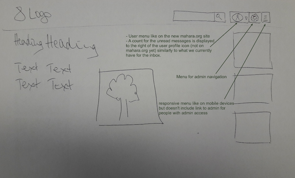
We are using the responsive navigation everywhere also on desktop but move the admin navigation out so it's more easily accessible for those that require it. The admin icon is still to be decided on as it a bit too close to the "Settings" one.
The navigation is context-sensitive. That means that when you are anywhere in the "Content" area and you click the "Menu" icon, you see the "Content" navigation items directly and don't have to click on "Content" first. And when you are in "Portfolio", you see all menu items in that section. When you are in "Configure site" in the admin area, you see all those navigation elements etc.
In the transition period to the new navigation, we will keep the "old-style" navigation available in Mahara:
- Hide the drop-down menu option in site and institution settings.
- Keep the value in the database though.
- Duplicate the current raw theme and call it "Raw old navigation" keeping all current templates in place so that a site could switch the base theme from "Raw" (the new nav) to "Raw old nav" in order to regain the old navigation. If they want to change the value for the drop-down navigation, it would need to be done in the database though.
- Have all built-in themes in Mahara use the new navigation, i.e. stay on the new "Raw" that has been stripped off the old navigation styles.
Ideas for the future beyond the initial implementation for Mahara 17.04
Be able to pin items under the user menu for easy access.
