Proposals/Done/Mahara Mobile
From Mahara Wiki
< Proposals | Done
MaharaDroid is being upgraded to Mahara Mobile.
Overall requirements
- offline use
- accessible
- default Mahara color scheme and logo
- storage: Use device storage for any files
- connect via various authentication methods
- internal
- LDAP / AD
- SAML / other third-party SSO
- Persona
- MNet (later because it's trickier to implement due to the login being on Moodle rather than Mahara)
- internationalization
- adding file
- adding file in bulk
- bulk delete of pending files
- editing pending files and journal entries
- creating of journal entries
- get tags and default folder from the Mahara instance
- get notifications from Mahara (no settings -> Choosing the notifications should happen on Mahara)
- taking photos
- pending upload for when you are on 3G and not wifi
- sync and manual upload trigger
- default settings for folder, tags, journal
- show custom theme based on Mahara theme -> nice to have
- simple photo editing (cropping, rotating) -> nice to have (workaround: take photo first and edit with device tools and then add to Mahara Mobile)
- history of uploaded items -> nice to have
Mock-ups
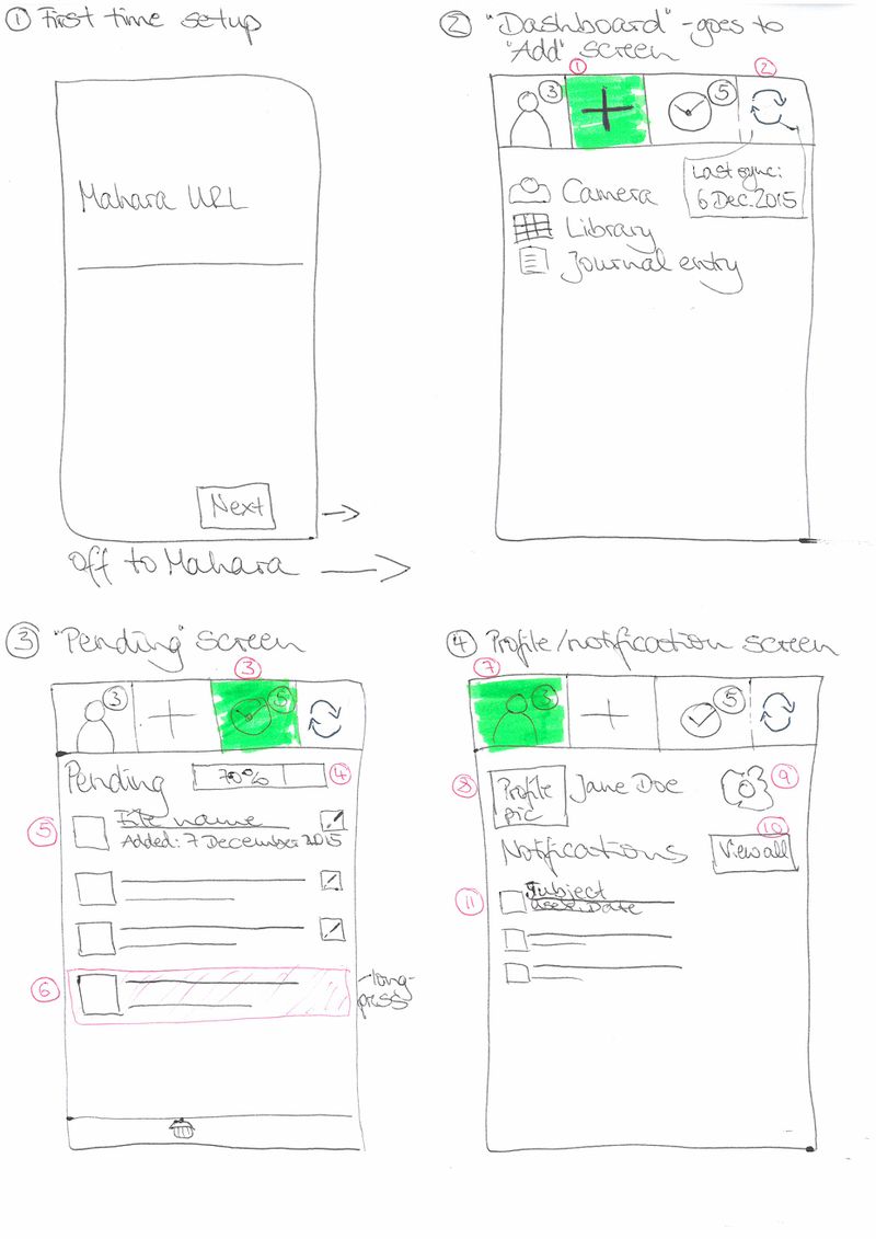
Screen 1: First-time setup
- There's a splash screen that's not pictured. So technically, this is Screen 2.
- When clicking the "Next" button (or maybe "Connect"), you are taken to your Mahara instance where you log in and then are taken back to Mahara Mobile.
Screen 2: Add items
- Three main actions as buttons / tabs: Profile, Add, Pending (they could sit at the bottom of the screen if on iOS). The first screen is the "Add" screen with the three items of "Camera", "Library", "Journal entry".
- When you click the "Camera" item, you are taken directly to the camera.
- When you click the "Library" item (or "Files"?), you are taken to the file browser.
- When you click the "Journal entry" item, you are taken to the screen on which you create a journal entry. That screen stays pretty much the same as it is.
- The sync is an icon and not a button. It can show a last sync time in a "bubble off to the side"
Screen 3: Pending
- Pending icon has a little indicator showing the number of items that await a sync.
- Progress bar for the upload of all items in the queue
- Each pending item shows a small thumbnail, the title of the file and when it was added (if possible). There is also an edit button to make changes.
- When you long-press an item, it changes color and the "Delete" button becomes available. You can select more than one item to delete.
Screen 4: Profile/notifications
General:
- Only display notifications from the last month
- The notifications that are to be displayed in the mobile app are configured on the Mahara notification settings screen (change to be made there).
Specific info:
- The profile button / tab has an indicator for the number of new notifications.
- A small profile picture and the name of the user are displayed.
- A configure button takes the user to the settings for the app where default values can be configured or another server connected to.
- A "View all" button allows to show all available notifications, i.e. also those that had been hidden previously
- Notifications can be swiped off the screen. They aren't deleted, just hidden. The notification item contains the icon for the notifcation type (from Mahara), the subject line, the user and the date (all info to be taken from Mahara)
